The best billboard design combines smart messaging and bold creative to grab people’s attention. Good billboards should be easy to understand and include a clear call to action. They must have a clear subject and goal.
Does that sound like a tall order for a form of advertising that generally includes seven words or less? Yes. Billboard designs should be simple but the thinking behind them should not. Getting a point across in five seconds is a challenge. Arguably no other form of advertising has such a limited window to forge a connection.
As billboard experts, we have worked on hundreds of campaigns and learned what works and what doesn’t in billboard design. Here are our 10 best tips to help you design an effective, eye-catching billboard in 2024.
1. Include a Single Call to Action
First, let’s address the most important part of the billboard: What you want people to do. This is the call to action, and it’s critical that you only put one in your board. Including more than one confuses the message. For instance, if you include a phone number AND a URL, people may wonder which one they’re supposed to use (not to mention, they probably won’t have time to write down the number, though they can remember a URL).
It should be clear what people should do from that CTA as well. Using short commands like “shop now” or “order now” makes your desires clear. If you want them to go directly to your store, then give the physical address and not a URL; people may feel unsure whether you are brick-and-mortar or online.

2. Limit Your Words
Driving is a serious responsibility. Most of your attention is on the road, and even passengers only have limited time to look at what’s outside the car. Studies have shown the average view time for billboards is six seconds. That is not a lot of opportunity, so you need to minimize your words and maximize their impact.
The conventional wisdom is seven words total; we’ve been known to go a bit above or below that. Other tips:
- Use strong verbs and commanding language.
- Speak directly to the person reading the board.
- Cut out extra, unnecessary words, like “very” or “many” or “really.”
- Keep most of the words short.
3. Focus on One Image
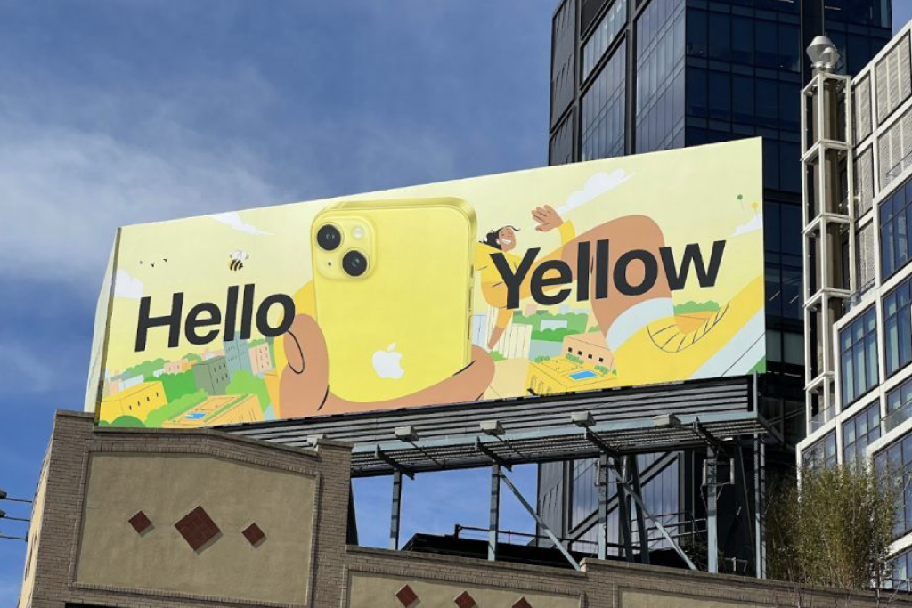
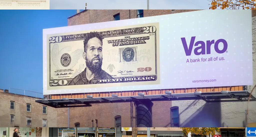
Billboards may seem big, but they only have enough space for one dominant image. Some advertisers try to squeeze more on there, but often that becomes distracting. Again, simplicity rules. Choose a single image for your campaign. The accompanying words can extend the story, but the image should convey your main point.

4. Be Bold
Subtlety is fine for a longer radio commercial, a TV ad or a print campaign. It doesn’t work for billboards. You need boldness across the board — in the messaging, the colors, the fonts and the image. Keep this in mind as you think about design and also as you plan the campaign. Choose bold locations. Embrace bold goals.
Don’t be afraid to try something daring. Billboard campaigns only last four weeks. It’s the perfect window to experiment. If it doesn’t work, you can try something else the next time.
5. Use Contrasting Colors
Boldness also applies to colors. You want dark print on a light background or light print on a dark background. Do everything you can to help people see your message.
6. Pick and Size Your Fonts Carefully
For a typical 14×48-foot billboard, your font should be at least 24 inches tall — remember, people are viewing this from far away.
7. Stick With One Vibe
As you may have noticed from our tips by now, consistency is key for billboard advertising. This is a single-frame campaign. You don’t have room for nuance — it will confuse people if you try to cover too much in your six-second bid for people’s attention. So when it comes to picking a mood for your billboard, settle on one thing and stick with it.
You can be whimsical or straightforward or playful; just don’t be whimsical, straightforward and playful all at once. The best billboards leave a strong impression. Mixing vibes confuses people.

8. Think Creatively
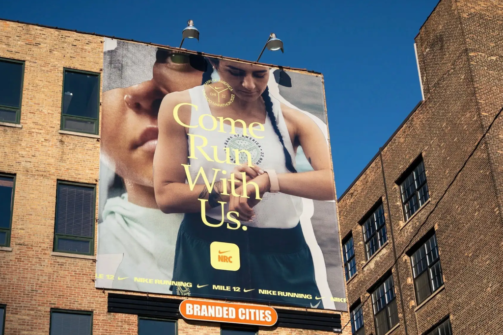
Your billboard can be whatever you want it to be. That’s the beauty of this format. While a standard billboard measures 14×48, you can add edging or extra panels to extend it — a real outside-the-box situation. Consider different formats, too, such as digital or 3D. While traditional billboards are an amazing option, they are not the only ones available. You can even combine several different types of billboards into a more impactful campaign.
9. Also, Think Local
People love seeing callouts to their city, state or region on advertising. It makes them feel seen. If you can localize your billboard in any way, by including pictures of a local landmark or using a phrase only that city’s inhabitants would understand, do it.
10. Follow These Steps in Designing a Billboard
Here are some of the nitty-gritty steps in billboard design:
- Get all the submission information from the vendor. They can give you exact dimensions of the board, tell you what file format they want for digital, offer advice on scaling and more.
- Remember to leave room for the bleed on every side.
- To mimic the look from far away, take three big steps back from your computer screen and look at your image. That is more like what passersby will see than sitting right in front of the screen.
- If you have to list terms and conditions, check with the vendor on sizing. Some have strict rules on printing size.
- Use the vector art format to ensure that when your image gets blown up, it won’t become pixelated or blurry.
Design the Best Billboard for Your Needs
Still uncertain about the best way to approach your billboard campaign? Let us help. We can offer suggestions, walk you through the process, do everything for you — we offer whatever level of support you need. Contact us today.

