Want to know what makes a great billboard? It’s pretty simple. It’s the billboard that gets noticed. Attracting attention to your board, making it stand out from the clutter on the highway or cityscape, is the secret to creating an eye-catching, memorable billboard.
If your outdoor advertising is good enough, people will also take photos of your board and share them on social media, giving your campaign a second dimension and boosting its reach. You can create smart billboards by trying these time-honored techniques:
- Integrating the objects around the billboard into your design
- Playing with the borders of the board
- Adding special effects
- Taking advantage of natural lighting
- Interacting with people who pass by
- Relying on clever visuals
Now, let’s see how advertisers and their agencies have implemented these ideas to achieve brilliant billboards passersby remember long after they’ve encountered your advertisement. Here are eight of our favorite billboards from the past few years.
1. The Nose Hair Guy

You may have seen this Indonesian board making the rounds on social media a few years ago. It’s the ultimate example of integrating nearby objects into a board, turning what might have been a distracting location into an inspired visual.
The board, advertising a nose hair trimmer, shows a cartoonish picture of a guy with very wide nostrils. Coming out of each nostril is what looks at first glance to be the world’s largest, thickest nose hairs. On second glance, you realize the “hairs” are actually power lines.
The board sits on top of a powerline pole, and it has two strategic holes allowing the power lines to stream out, creating the illusion of really long nose hair.
2. The Light Bulb Moment

The Economist is known throughout the world as a thought leader, publishing some of the world’s most luminous minds. Often its stories are aimed at seeing things in a different way — creating a light bulb moment, if you will. The magazine makes that moment literal with a street-level interactive board in the UK.
The board features a light bulb positioned roughly 7 or 8 feet off the ground and in the center, against a stark red background. The light bulb remains dark until the moment a passerby walks beneath it. Then the bulb, thanks to motion sensors, lights up. It appears to people looking at the board as though the person walking under just had a fantastic idea — the light bulb moment.
3. Tough Teeth

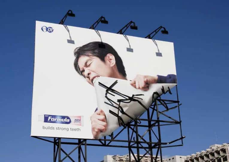
Another board from Indonesia shows the fun you can have with the “confines” of a billboard. It shows a man who appears to have yanked up the corner of the billboard with his teeth. You can see the metal structure of the board, where it used to be attached, now somewhat out of wonk thanks to his feat of strength.
The advertiser? A toothpaste that wanted to show how its brand builds strong teeth. Mission accomplished — this is a prime example of the message perfectly meshing with the delivery.
4. Climbing to the Top

Most billboards are only viewed for 6 to 8 seconds. You need to make your point, and you need to make it fast. Woodland came up with a clever way to convey its message. The company makes climbing shoes. It placed a mega-sized shoe on top of a largely blank billboard, with only the Woodland logo and a simple phrase: “climbing shoe.”
Putting the shoe above the billboard draws the initial attention by going outside the space’s traditional confines. It might take a second for the message to click, but when it does (hey, that shoe climbed up the billboard!), the viewer will definitely be amused.
5. A Steaming-Hot Pizza

Donatos
When a pizza arrives at your table at a restaurant, piping hot and right out of the oven, it emits a wave of heavenly smelling steam that you can see wafting above the pie for a few minutes. A billboard for Donatos Pizza recreates that fresh-baked pizza look.
The billboard shows a giant, delicious-looking pizza, with words to the side highlighting the hand-tossed pizza’s awesome taste. Lots of billboards show pizzas, though. What sets this one apart is the actual steam rising from the pie.
A blower placed strategically below the board produces the steam, which billows up right above the pizza and makes it appear as though the pizza has just come out of the oven.
6. “Hair” That Changes Color

Taking advantage of natural changes in light can give a billboard an entirely new look from one hour to the next. A strategically placed board with a cut-out figure of a woman sporting a big mane of hair does this to great effect. It advertises a hair colorant from Koleston Naturals.
The board is situated on a large body of water in Beirut, where the sun shining on the water reflects a beautiful range of colors—soft pinks, gentle oranges, radiant yellows. Depending on the time of day, the woman’s “hair,” really the water and its horizon, look completely different, just like the Koleston product would do for real hair.
7. A Restroom Signifier’s Gotta Pee

Of course, sometimes it’s the simplest messages that are the best. Taking a well-known symbol and tweaking it a bit can result in a memorable, funny ad people will notice.
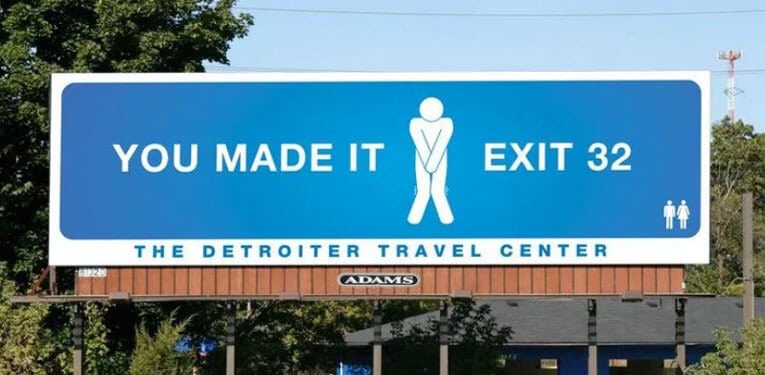
The Detroiter Travel Center did this by taking the iconic symbol for the men’s bathroom, and making it look like the guy had to use the restroom himself. The stick figure assumes the half-squat, arms-crossed position known across continents as “I’ve gotta pee.”
The signage around him reads “You made it” and displays the exit number for the rest stop. Straightforward. Humorous. Effective.
8. Wait, What Did That Say?

Rounding out our list of eight smart examples of billboard advertising is one that, again, takes an uncomplicated concept and turns it on its head for a board that really stands out. Colorado Crisis Services wanted to get people to call in when they are struggling. How to explain what that means, when it’s different for every person?
Creating a universally understood stand-in for “struggling” proved to be the key to this billboard. The message read: “When life sotps mkanig sense.” Yes, those typos are on purpose – they show how the mind can become jumbled and the simplest things feel off kilter when your mental health is not at its best. The board also included the number to call for the crisis hotline.
These boards all work because they draw attention, and they reward that attention with a smart message that ties in with the product or service offered. Remember, it’s not just getting people to see your ad. It’s using that captive moment to tell your story, too.

