
The best billboard designs and billboard best practices in 2026 blend sharp messaging with bold, high-impact visuals to stand out in a fast-moving world. Effective billboards are clean, direct, and anchored by a clear call to action. The secret? Start with a focused subject and a defined goal that instantly connects with your audience.
Think it’s challenging to grab attention in just seven words or fewer? It is. Designing a great billboard requires simplicity in form and depth in strategy. With only five seconds—or less—to make an impression, your message needs to be fast, memorable, and on point. Few ad formats demand this level of clarity under such tight constraints.
As seasoned billboard experts, we’ve created and analyzed hundreds of campaigns. Our experience has uncovered the core tactics that consistently drive results. Here are our top 10 tips to help you design a bold, effective, and unforgettable billboard in 2026.
1. Include a Clear, Singular Call to Action
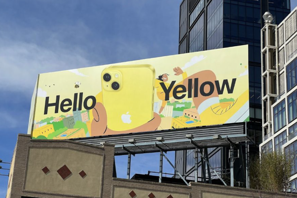
Let’s start with the most essential element of your billboard: what you want people to do. This is your call to action (CTA), and it should be singular and unmistakable. Including multiple CTAs—like a phone number and a website—can dilute the message and confuse viewers. In most cases, a URL is far easier to remember than a phone number, especially when someone’s driving by.
Your CTA should be short, direct, and action-oriented. Phrases like “Shop Now,” “Buy Tickets,” or “Visit Us” work well because they clearly tell people what to do next. If your objective is foot traffic, include a street address instead of a website. That keeps your message focused and clarifies whether your offering is physical or digital.
 Hello Yello
2. Limit Your Words
Driving is a serious responsibility, which means attention spans are short—even for passengers. Research shows the average viewer spends just six seconds reading a billboard. That’s not a lot of time, so your message needs to be short, sharp, and immediately impactful.
The long-standing rule is to stick to around seven words total—we sometimes flex that slightly, but less is definitely more. Here are a few key tips to help your copy land fast:
- Use strong, action-oriented verbs and commanding language.
- Speak directly to the viewer—make it personal and engaging.
- Eliminate filler words like “very,” “really,” or “many.”
- Choose short, punchy words that are quick to read and remember.
3. Focus on One Bold Image
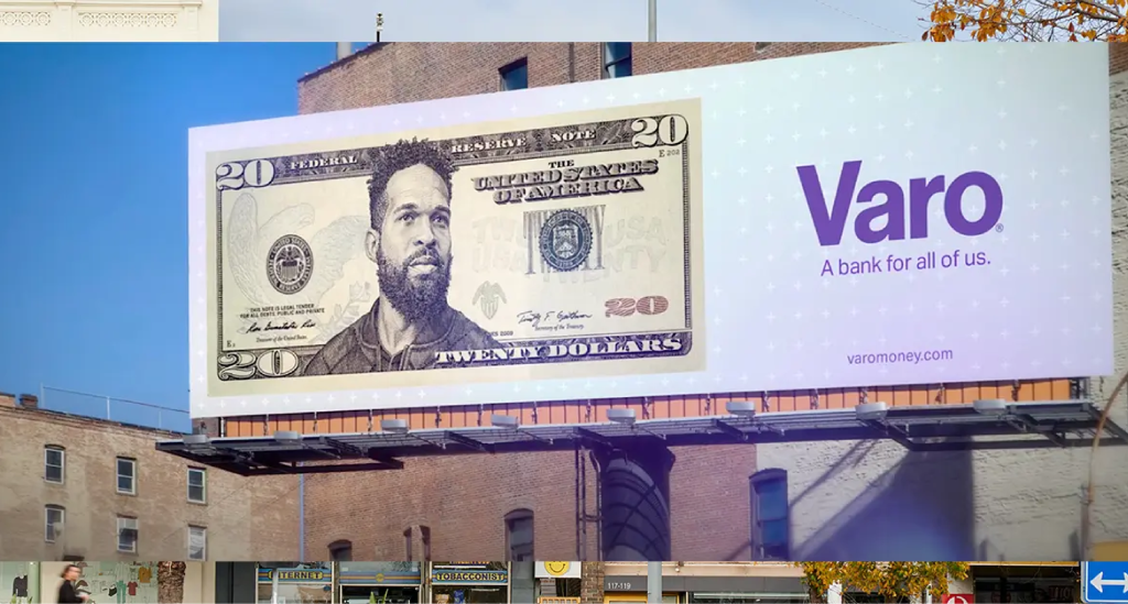
Billboards may be physically large, but that doesn’t mean you should fill them with visual noise. The most effective designs rely on simplicity—starting with a single, dominant image. Adding multiple graphics or competing visuals can create clutter and dilute your message. Instead, choose one strong image that instantly grabs attention and supports your core message.
Your text can help reinforce the idea or provide context, but your visual should do the heavy lifting. A clean, high-impact image improves recall and makes your billboard more striking and memorable to viewers in motion.
 Varo
Varo
4. Be Bold
What works in a TV spot or magazine ad—subtlety, nuance, slow reveals—simply doesn’t translate to billboards. To make an impact in 2026, boldness is everything. Your billboard should pop with striking colors, large type, powerful visuals, and a confident message that leaves no room for confusion.
This principle extends beyond the design itself. Choose bold, high-traffic locations and set ambitious campaign goals. Billboards typically run for about four weeks, making them perfect for experimentation. If one concept underperforms, treat it as a testing opportunity and go bolder in your next round.
5. Use High-Contrast Colors
Bold design doesn’t stop with the visuals or copy—it extends to your color palette. Using high-contrast color combinations is essential for both visibility and readability, especially at a distance or in fast-moving traffic. Think white text on black, black on yellow, or bold red against white—anything that pops.
Strong contrast helps your message stand out instantly and ensures that viewers can read your billboard quickly and clearly. Avoid low-contrast pairings or colors that blend together, especially under bright sunlight or nighttime lighting conditions.
6. Pick and Size Your Fonts Carefully
Font choice can make or break your billboard design. On a standard 14×48-foot board, your text must be large enough to be read at a glance—typically, at least 24 inches tall. Anything smaller risks being overlooked entirely, especially by fast-moving traffic.
Opt for clean, bold typefaces that maximize legibility. Avoid script fonts or anything overly decorative. Your goal is clarity, not style points. When in doubt, test your design at scale or simulate viewing distance to ensure your message is readable from afar.
7. Stick With One Vibe
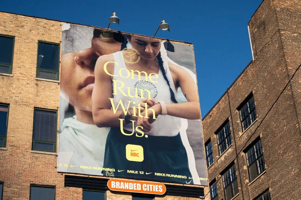
If you’ve picked up anything from these tips so far, it’s this: consistency is critical in billboard advertising. A billboard is a single-frame message—you’ve got six seconds or less to connect. There’s no room for mixed signals or layered nuance. Trying to be too many things at once only weakens the impact.
Choose a tone—whether it’s bold, clever, playful, or direct—and commit to it. You can be whimsical or straightforward or cheeky—but not all three at once. The strongest billboards deliver a clear vibe and leave a lasting impression. Mixed messaging confuses your audience and makes your campaign forgettable.
Branded Cities
8. Think Creatively
Your billboard doesn’t have to stick to the basics. That’s one of the most exciting aspects of out-of-home advertising—it’s a creative playground. While the standard size is 14×48 feet, you can break the mold by adding extensions, edging, or custom panels to give your design a truly eye-catching twist.
Don’t limit yourself to static formats. Explore other options like 3D installations, animated digital billboards, or even a hybrid campaign that combines multiple billboard types for added impact. When done right, thinking creatively not only boosts visibility—it makes your campaign unforgettable.
9. Don’t Forget to Think Local
People love seeing references to their city, neighborhood, or region in advertising—it creates an instant sense of connection. If you can localize your billboard in any way, do it. Whether that means using imagery of a recognizable local landmark or incorporating a phrase or slang only locals would understand, these small touches go a long way.
Localized billboards feel more personal and relevant, making them more likely to grab attention and spark engagement. It’s a great strategy for both national brands wanting to connect regionally and local businesses trying to build community awareness.
10. Follow These Key Steps When Designing a Billboard
To ensure your billboard looks professional and performs effectively, follow these essential design steps:
- Get full submission specs from your vendor. They’ll provide the exact billboard dimensions, preferred file formats, scaling ratios, and other technical requirements.
- Always account for bleed. Leave adequate space around the edges of your design to ensure nothing gets cropped during installation.
- Preview your design from a distance. Step several feet back from your screen to simulate how it will appear to drivers or pedestrians viewing it on the street.
- If your creative includes terms and conditions, check with your vendor for minimum font size guidelines. Many vendors have strict rules to ensure legibility.
- Use a scalable vector file format to avoid pixelation. This keeps your design crisp and clear when printed at large scale.
- If combining your billboard campaign with social media, be sure to check print-social best practices.
Want a billboard designed that actually gets noticed? DASH TWO handles creative and media buying end to end — from concept to a board that’s live.
How Long Do Drivers Have to Read a Billboard?
The standard estimate is five to seven seconds — that’s the average window a driver or passenger has to see, read, and process a billboard at highway speed. In dense urban environments with slower traffic, you might get a few seconds more. In high-speed corridors, you might get less.<
That constraint shapes every design decision on this list. Five seconds is enough time to absorb a logo, a headline, and a CTA — if each element is doing exactly one job. It’s not enough time for a paragraph, a list, a phone number, and a website. Every element you add past the essential three competes for the same five seconds.
The practical test: read your billboard copy out loud. If it takes longer than three seconds to say, it’s too long.
Designing for Digital Billboards
Digital billboards play by different rules than printed vinyl. The canvas is the same size, but LED screens are brighter, the regulations are stricter, and the file you hand the vendor looks nothing like a print-ready PDF. A design that works perfectly on a static board can underperform — or get rejected outright — on a digital one. Here’s what changes.
Build a static frame, not a video
Most U.S. digital billboard networks — Lamar, Clear Channel Outdoor, Outfront — prohibit full-motion video, flashing elements, scrolling text, and animated transitions on roadside boards. Federal and state DOT rules treat movement as a driver-distraction hazard. Your deliverable is a static image (JPG or PNG) sized to the exact pixel dimensions of the board. Motion is generally allowed on in-stadium screens, transit, and some urban spectaculars — but assume static unless your vendor confirms otherwise.
Design for an 8-second slot
The industry standard rotation gives each advertiser an 8-second display window, looping every 48 to 64 seconds depending on how many advertisers share the board. You have those 8 seconds to land the message — no sequencing, no slow reveals, no second chances. If your creative needs more than one frame to make sense, it’s the wrong creative for digital.
Submit in RGB, not CMYK
Digital billboards are LED panels, which render color in RGB. Submitting a CMYK file (the print default) forces the vendor to convert it, and the conversion shifts colors every time — reds dull, blues muddy, brand colors drift off-spec. Build the file in RGB from the start and pull hex values directly from your brand guide.
Push contrast harder than feels necessary
LED screens hit 5,000 nits or more in daylight and dim to 300 to 500 nits at night. That brightness is great for visibility, but it flattens subtle color differences. A pale gray subtitle that reads fine on print can disappear entirely on an LED panel at noon. Push your contrast one step past what looks balanced on your monitor, especially for secondary text and logos.
Match the board’s native resolution
Not all digital boards are the same pixel density. A typical 14×48-foot highway digital runs around 400×1400 pixels — which sounds low, but at 300 feet of viewing distance, it’s more than enough. Smaller urban and transit screens can be denser. Your vendor will give you exact pixel dimensions and a file-size cap; submit at native resolution to avoid scaling artifacts. Use vector files for source design, but deliver a raster file at the board’s exact size.
Build extra time into the approval window
A printed vinyl board gets installed once and runs four weeks. A digital board rotates creative on a schedule shared with other advertisers, which means vendors review files more carefully and queue them into the loop. Most networks require submission 5 to 7 business days before flight start. Build that into your timeline — late files don’t run.
Designing for 3D and Anamorphic Billboards
Anamorphic 3D billboards — the ones where a wave crashes over the edge of the screen or a character leaps out of the frame — have become the most-shared format in out-of-home, and they follow their own design rules. The illusion only works from a single vantage point, so the creative has to be built for that fixed viewing angle and the exact curved or L-shaped board it will run on (confirm the standard billboard dimensions for your placement before you start). Keep the hero object simple and instantly readable, lean on depth cues and a dark or negative-space background to sell the pop-out effect, and budget a longer production and approval window — these are 3D-rendered builds, not a flat export. When it lands, the payoff is huge: a single anamorphic board can earn more reach on social than it ever will in physical impressions.
Common Billboard Design Mistakes
The ten practices above are what to do right. These are the mistakes we see even seasoned marketers make — not in the design file, but in the decisions around it.
Picking the wrong location for the message. A great design on the wrong board is wasted spend. A luxury brand on a budget rural route, a B2B SaaS pitch on a suburban commuter highway, a Spanish-language CTA in a market with no Spanish-speaking audience — the design isn’t the problem, the placement is. Always start from where your audience actually drives, not from which boards are available.
Designing without seeing the approach. A board on a curve, behind a tree line, half-blocked by an overpass sign, or facing west into late-afternoon sun is a different design problem than a clean stretch of highway. Ask your vendor for a daytime and nighttime photo of the exact unit, from the approach direction your viewers will see, before you start the file.
Burying the brand. Designers fall in love with clever billboards and shrink the logo to give the concept room to breathe. If a viewer can’t identify whose ad it is inside five seconds, the cleverness cost you the impression. The logo doesn’t have to dominate, but it has to be unmistakable.
Flighting too short to build recall. A two-week flight in a single market rarely moves the needle. Out-of-home builds through repetition — the same driver passing the same board on the same commute, twice a day, for a month. Four weeks is the floor for an established brand. Eight weeks is the floor for a brand the market doesn’t already know.
Trusting the proof on your monitor. A design at full size on a 27-inch screen is roughly 6 feet from your face. The same design 300 feet down a highway is something else entirely. Shrink the proof to thumbnail size, walk across the room, and read it from there. If you can’t, neither can the driver.
Running the board in isolation. A billboard generates impressions, not conversions. When it runs alongside the matching paid social campaign, retargeting pixel, and search keyword strategy, those impressions compound. When it runs alone, you’re paying for awareness with no funnel underneath it. Plan the digital pairing before you book the flight.
Approving the install from the invoice. Vendor proofs aren’t always color-accurate, and the install can crop the bleed unpredictably. Ask for an installation photo within 24 hours of flight start, compare it against your file, and flag any color shift, crop, or alignment issue immediately. Most vendors will reprint if you catch it in the first week.
Design the Best Billboard for Your Needs
Still uncertain about the best way to approach your billboard campaign? Let us help. We can offer suggestions, walk you through the process, do everything for you — we offer whatever level of support you need. Contact us today.